

Choosing a water dispenser used to mean picking whatever bulky, beige box that fits in the corner. Nobody thought twice about how it looked, only whether it worked. Kitchens have changed since then, and so has what we expect from the appliances sitting on our counters.
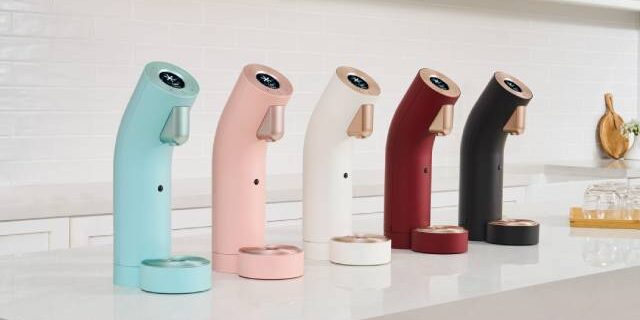
Wells The One flips that old thinking on its head. It comes in five different colours, which means the finish you choose says just as much about your kitchen as the tap or the cabinetry does. If you’re staring at swatches and wondering which one actually belongs in your home, this guide should help you land on the right answer.
Why colour matters more than you’d think
A water dispenser sits on your counter every single day. Unlike a blender you tuck away after use, this is a fixture. It’s there when you’re making coffee in the morning, filling up a bottle before the gym, or grabbing a glass of cold water at midnight. Given how often you’ll see it, the colour you pick shapes the overall feel of your kitchen far more than most people expect.
Wells The One water dispenser is built with a modern design, a digital display screen and tactile touch controls, and it’s designed to fit into different kitchen aesthetics rather than forcing your kitchen to fit around it. That’s the whole point of offering five colours instead of one.
Matching finishes to kitchen styles
Here’s a simple breakdown to help you narrow things down:
- White or off-white kitchens pair well with lighter, softer tones. A pale finish blends in quietly and keeps the space feeling open and airy.
- Monochrome or industrial kitchens with black cabinetry, concrete countertops or exposed steel elements suit a darker, bolder finish. It adds contrast without clashing.
- Warm wood-toned kitchens work nicely with neutral or muted colours that don’t compete with the natural grain and warmth of timber cabinetry.
- Colourful or eclectic kitchens give you more room to play. A statement finish can become a small design feature rather than just an appliance.
There’s no strict rulebook here. Some homeowners prefer their dispenser to disappear into the background, while others want it to stand out as a talking point. Both approaches work, so long as the finish feels intentional rather than accidental.
Think about your countertop first
Before you fall in love with a colour, take a proper look at your countertop and backsplash. If your surfaces already have a lot going on, whether that’s veined marble, patterned tiles or a busy colour palette, a neutral dispenser finish tends to work best. It won’t fight for attention.
On the other hand, if your countertop is plain and understated, this is where you can afford to go bolder with your choice. A dispenser in a striking colour can inject some personality into an otherwise minimal space without needing to renovate anything else.
Small kitchens benefit from restraint
If your kitchen is on the smaller side, and many homes in Singapore fall into this category, a lighter or more neutral finish generally makes the space feel bigger. Darker colours can visually shrink a room, especially when placed on countertops that are already tight on space.
This is also where a compact and minimalistic footprint matters. Wells The One water dispenser is tankless, so it doesn’t eat into your countertop space the way older bottled dispensers used to. Choosing a finish that blends with your existing colour scheme, paired with a design that doesn’t take up unnecessary room, helps a small kitchen breathe a little easier.
Consider how the space is used
Family kitchens that see a lot of daily traffic, from packing school lunches to prepping dinner, often benefit from a finish that hides fingerprints and smudges a bit more forgivingly. Busier households might lean towards mid tone colours for this reason, since very light or very dark finishes can show marks more easily.
If your kitchen doubles as an entertaining space, where guests gather around the counter while you cook, you might want a finish that photographs well and looks polished under different lighting. Warmer, softer tones tend to look inviting in both natural daylight and evening lighting.
A quick comparison
| Kitchen style | Suggested finish direction |
| White or light minimalist | Soft, pale tones |
| Black or industrial | Bold, darker tones |
| Wood toned or Scandinavian | Neutral, muted tones |
| Colourful or eclectic | Statement colour |
| Small or compact | Light, space enhancing tones |
Use this as a starting point rather than a fixed rule. The best choice is always the one that fits how your kitchen actually looks and feels day to day, not just what trends suggest.
Function still comes first
While colour is a fun part of the decision, don’t lose sight of what a water dispenser is meant to do. Wells The One water dispenser offers hot and cold water on demand, with different temperature settings so you can dispense warm water for baby formula or hot water for your morning coffee without waiting around. It also runs through nine stages of nanofiltration, so you’re getting clean, purified water regardless of which colour you pick.
In other words, every finish gives you the same performance underneath. The colour is simply the layer that lets the dispenser fit naturally into your home rather than looking like an afterthought.
Take your time with the decision
If you’re still torn between colours, it helps to look at physical swatches under your own kitchen lighting rather than relying on photos online. Lighting can shift how a colour reads, and what looks perfect on a screen might feel different once it’s sitting on your counter.
It also helps to picture the dispenser alongside your other appliances and fixtures rather than in isolation. A finish that looks great on its own might feel out of place once it’s next to your kettle, tap or cabinet handles.
Ready to see the colours in person and find the finish that suits your kitchen? Head over to Wells Singapore to explore the full range of water dispensers, including all five finishes of Wells The One, and get in touch with the team for guidance on choosing the right one for your home.
